This is going to be a long post so please bear with me! Here are a couple teaser before and afters!
I have wanted to update our old master bath for over a year now, and we finally did it!
We knew it would be an expensive and time consuming project, but we finally dove in!

Here are more before photos. I think I painted this bathroom back in 2001. I was so proud of the sponge technique. Not anymore! There were navy blue tiles around a sink that had a yellow glue seeping out from it all the time.
All the wood is a faux oak. The trim had an oak paper cover on it.
This was the part that I really hated, this amazing jacuzzi tub, with 2 large mirrors on each side. Are we still in the 70's??? This house was built in 2000 and they still do that!
So lets get to work! 1st things first! Remove the mirrors and put in windows! A million times better already!
Next was the nasty. leaky skylight. My hubby patched the hole and re painted the ceiling. You would never even know.
Doors and trim-everything was painted white! I never thought they would look as good as they did. We did buy all new base board, but the trim and doors were updated with a little paint and new hardware.
Now for the good stuff! I am so excited about how this came together!
We did remove some of the cabinets but have plenty of storage in the closet in the bathroom and another one in the adjacent room.
The vanity and counter top are new. We decided that the one we had just needed to be replaced.
This chair was an old theater chair my dad came across for me. It was about to be thrown out! I will post later on how I re-did it. It was unfinished and painted black.
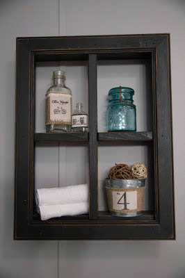
The shelf and most everything on it & throughout the bathroom I already had. I love re purposing things from my home! I didn'y buy any of the decor other than the towles!
I love ladders, and they work great for hanging towels!
The flooring came together so well! It's a floating wood floor from Home Depot! I may be doing this in more rooms of the house! I love how it looks!
I made this using some linen, free word art and my ink jet printer! Placed in an inexpensive frame for some perfect bathroom art!
This was quite the project! I made the shower curtain from a combination of cotton fabric and sheets! I am glad I own a ruffler foot, there are 20 rows of ruffles here! I used grommets on the top for hanging, it is very heavy and I didn't want to to tear.
The curtains below were also made from sheets. I will be posting a tutorial later on how to make them!
My husband didn't want real candles in the birdcage so close to the ceiling, they would cause the ceiling to turn black. So I found some remote control LED candles at target! Genius!
After all that work, I am ready for some wine in here!
Thanks for sticking with me! Now if only I could fit my bed in here.


9 comments:
Looks AMAZING! Beautifully done thank you for sharing and don't forget the chocolates with that wine...
Wow! This is quite the transformation.... It looks great... Love the chair and the shower curtain.. Thanks for sharing. Blessing...
By the wy, I am going to follow along with you.... Hope you will stop by and visit with me and follow along with me too. Blessings!
Oh my what a gorgeous makeover. Congrats!!!
I love that chair
Hugs
SueAnn
Oh wow! This is absolutely lovely! I just re-did my master bath as well....so much work. Visiting from Sumo's Sweet Stuff
http://24cottonwoodlane.blogspot.ca/2013/01/master-bathroom-reveal.html
soo gorgeous. amazing what a little paint can do. that looks like so much work:)
Very nice Missy. Now following from Int'l Falls. Cold here tonight.
Gorgeous transformation! I LOVE the photo of the tub with the candles...oh my...Calgon take me away!!!!!!!
Karen
You’ve been totally better in maximizing the space! I really approve of removing the closet beside the door. The entrance seems so crowded because of it. I also like the new color scheme, Luu. It is more refreshing, and it doesn’t look traditional at all. :)
-->Lida
Post a Comment